Unpacking Cognitive Load
Navigating Design, Accessibility, and Decision Fatigue in the Digital World
I wear many hats. At work I'm a 🎩 UX Architect. My recreational hats: 🕸 Web Developer, 🕹 Hobbyist Game Developer, 🎙Podfaded Podcaster.
I found Beth J's recent post "The lazy load, endless scroll, and color slicing have to go" to be a thought-provoking read. I found myself connecting it with a number of things I've read recently that I'll try to link to as I go. It really made me reflect on a lot of things, I feel like it's going to be one of those articles that lurks in the back of my head for awhile. I want to share some random things it's making me consider before I forget.
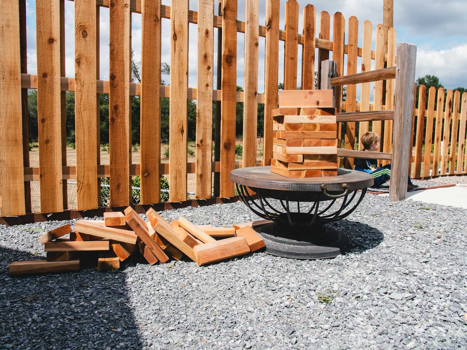
I try not to use a lot of design or technical buzzwords at work, lay people tend to find them confusing. There is however, one I say most often, because it comes up constantly: cognitive load. I'm no psychologist, so I'm sure I lack nuance in my understanding but, "cognitive load" is your working memory, what you can sensibly keep in your head at a given time. The expression of it that I find most people are familiar with is Miller's Law, which is the notion that the average person can hold 7 items (plus or minus 2) in their head at a time.
I find myself bringing it up constantly simply because so much of user experience design is a push and pull, this careful balancing act of managing the needs of the user and the needs of the client. An example, you have a well designed thing that has say, 5 features in it and now there's a need to add 5 more things to add. It's the commonly accepted reason why phone numbers are 7 digits long divided in a chunk of 3 digits and one of 4 although it feels like it might be apocryphal. It's the reason why your designer won't let you have 15 items along your primary navigation.
Accessibility Concerns
I've been trying to put accessibility higher in my list of concerns, I'm sure it's no doubt largely driven by WebAIM's abysmal 2023 Accessibility Report and how we should all be ashamed.
Neurodivergent users or those with memory issues may have different limitations around Miller's Law. It's only in the last few years that I've discovered that I'm neurodivergent myself, so this really resonated with me and is a reminder that I need to re-evaluate my understanding of a lot of things in that context
Sighted users and those with sight deficits have differing experiences of your design. If you have an e-commerce site with a grid of products with 4 per row, well then the sighted user can probably scan it 4 products at a time. However, if you're using a screenreader it's an entirely text-based experience. The post has an excellent example to which I can only say "yikes, I hope that's at least at 2x speed"
Imagine you are a visually impaired person, though, and your way of navigating a website is through a screenreader that must dictate the following for each item on a list of 400:
“Looking at 1 of 400 items”>”Product 1"> “photo of model with blue t-shirt on”>
“on sale”>”Basic Tshirt”>”Navy Blue”>”$15.99">”view product details”>
“add to favorites”>”add to cart”>”next product”>”Product 2">….etc.
Physical design versus the intangibility of digital
Display table design in physical stores is something I know next to nothing about, but it's something I probably should have a better handle on even if I don't design tangible products. Category Pages, Featured Products, Sales Products these are all things that would sit on a carefully designed display in a store. It doesn't explicitly come up in the post but I found myself thinking more about physical/digital analogies and the importance of the place your user is in and how user location can have an affect on personas.
Page behaviour affects and is also affected by the mode of the user
The combination of lazy loading plus an endless scroll puts the user in a trance state. Of course it does, we've all lost hours to the social feeds before. The problem here is that this is counter-productive in a context where you're trying to sell something. The user begins to lose their place, individual products start to blend together and the user just doesn't remember what they're doing.
When each product is presented in the same format, nothing is memorable, and there is slight nuance only to style, color, and price. As such, users often scan the page for what looks different. They are looking for a clear emotional response to help them make decisions.
I also had a bit of an epiphany reading this. When I'm shopping online, I hate it when I can't easily open a product page in a new tab. I didn't exactly understand why I did that but this post identifies exactly why:
If they click on it, they aren’t sure they will be able to return to their place in line if they return to the listing page afterward.
YES! Exactly. I cannot trust that the category page I'm on is well designed enough that I won't lose all my carefully chosen filters and sorting and scroll position. And the longer the page get, the worse that problem gets.
I research things in much the same way, go to a page and while reading it middle-click everything that looks halfway useful. So I'll start with one page, and somehow by the third article I have 26 new tabs open. At some point, I might stop, take stock of anything what is open and decide if it's non-relevant, relevant, or interesting. Non-relevant tabs get closed. Interesting tabs are send to my bookmark db. Relevant tabs stay open. But even this can start to fall apart, if I hit an awesome list or something, that strategy of mine can really get out of hand and I just need to save everything and start over again. I have a great extension for that, OneTab. I mostly got it to save tabs lost in a browser crash, but it's great to dump all your tabs on to a page for easier scanning.
When users are feeling overwhelmed, they can make rash decisions or making a purchase they will not be happy with or leaving. It happened to me while I started writing this post. I was foolish and started just writing it. Then because I'd just woken up and my ADHD meds hadn't kicked in or I wasn't entirely sure what I wanted to say or what, I started to get overwhelmed. "Look at all those unfinished drafts already, just give up, post the URL on LinkedIn without commentary and be done with it," I thought to myself. I forced myself to make a bullet list of everything that I was thinking stream of consciousness style so my brain could have a nice little kernel panic for a bit. If you're reading this, then yay me, I got over that moment of overwhelm.
You need more chunks and smaller chunks
At the start of this post I mentioned the perennial UX design struggle of trying to wedge more things into a place where they won't fit. The fix for this is almost always reorganizing. Taking that list of existing features (buttons, menu items, what have you), the list of new features and then finding a sensible, logical and understandable way to group them and hopefully in an incremental fashion that doesn't require the user to relearn that whole thing.
One thing I did find myself disagreeing with is the point about pagination at the end, generally, I don't like pagination. To me, there's little difference between an endless scroll and a pagination control that shows you're on page 1 of 500, either way it shows you probably need better chunking or perhaps better ways to pare down a set of items with filtering and searching. In the context of browsing an e-commerce site, which is the focus of the article, it does makes sense to me. I'm just uncertain if that rule holds true in all contexts, I should do more research there to better understand my assumptions and see if they're even valid.